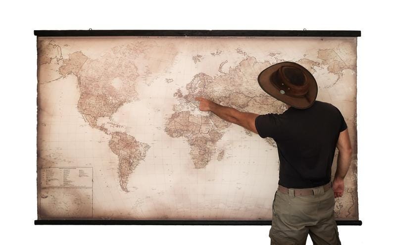
A world map can be more than just wall décor—it can become the focal point of a room and a reminder of the places you’ve explored or dream of visiting. When choosing a modern world map in antique style printed on canvas, two things matter most: color and size. Here’s a simple guide to help you choose the right one.
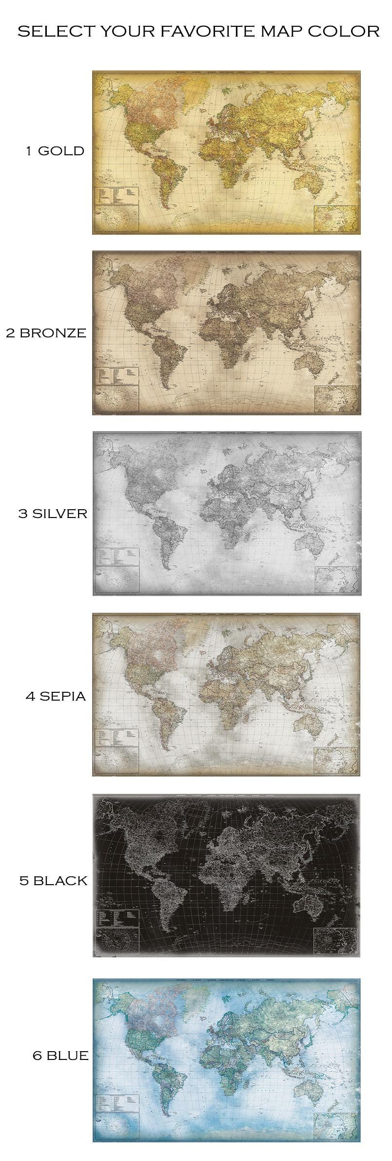
1. Choose a Color That Matches Your Interior
The map should complement the overall style of your room.
Warm antique tones Great for traditional, rustic, or vintage interiors, especially with wooden furniture. They create a cozy, timeless atmosphere.
Neutral tones Perfect for minimalist, Scandinavian, or bright interiors. They create a calm and elegant look.
Dark /blue tones Ideal for modern or industrial spaces and offices. These maps create a strong focal point on light-colored walls.
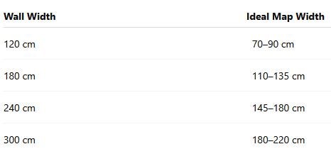
2. Pick the right size for your wall
Interior designers recommend that wall art should cover about 70–80% of the wall width.
3. Consider the furniture below the map
If you plan to hang the map above a sofa, bed, or table, choose a size that is about two-thirds to three-quarters of the furniture width. This keeps the composition visually balanced.
If still in doubt about the color scheme and size - contact us. We will be happy to make you a visual, in this case send us a photo of your wall/space and idea about the map.